Nevermore, part 1
Last week, I talked about The Raven, a comic project that Al and I worked on in college. Al suggested that we post some of the pages for you to see. Apparently he is privy to some cosmic crime for which we must atone. Outside of a few fashion faux pas from my youth, I can’t think of what I might have done to deserve this. With Al, it’s anyone’s guess. His past is mysterious and frightening.
We’re tag-teaming this one. My part is blue, and Al’s is red. Anyway, let the shaming begin… (Click on the thumbnails to see larger versions. I apologize for the poor quality of these scans. They were taken from a double-sided photocopy, and in some cases, the opposite side can be seen in the white space.)
I was 18 years old when we created this, a freshman at the University of Colorado-Boulder. I’d never taken any real formal drawing classes (nothing in art class from grades 1-12 was any kind of preparation for what we were attempting here). I was, at this point, nearly entirely self-taught, both at drawing and inking, and it shows. But that doesn’t excuse the myriad of sins committed by me with pencil and ink. Mea culpa.
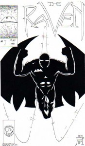
Here’s the cover of issue #1. Not bad so far. Just our hero in a dramatic pose. The Raven was basically a shameless ripoff of Batman with some samurai influences thrown in. Why samurai? Because samurai are cool, duh! That was about all the justification I needed. Batman is cool, samurai are cool, therefore Batman with a katana would be the coolest thing ever. Oh, and that ugly little face in the bottom left corner is “Chuk,” a silly doodle that I used to draw on everything. I don’t know why.
The logo is still kinda cool. It’s poorly rendered, but there are elements that I still like. The less said about the drawing, the better.
It’s clear that we were trying our darndest to make this look like a real comic cover. Adorable! Our moms should have put this on the refrigerator.
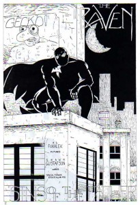
Here’s page 1, a classic watching-from-a-rooftop scene. I wrote the script for this issue with an early version of Microsoft Word that could only generate cliches. Later versions of the product rectified this bug.
Some of the lettering here was done by me as well, including a repeat of the logo and the nearly unreadable title (“Sins of the Father”). The layout of the page is not bad, even if the execution leaves something to be desired. I always enjoyed drawing the Raven’s cape, and it adds a little motion to an otherwise static page. Notice The Gecko, a character created by our mutual friend Ben Manti and included on the page for no apparent reason. I especially like the tip of the hat to Edgar Allan Poe; I wonder what he’d have to say about this?
He wouldn’t say anything. He’d just wall us up in his wine cellar, Amontillado style!
I’d like to continue to beat the dead horse of Poe references but I’m tapped out.
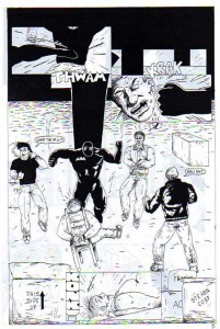
Action! The Raven cuts loose on some thugs. In the previous page, these guys were about to kill the poor schlub in the chair, but I think what really made The Raven mad was their horribly stilted dialog. (Don’t worry, I’m not hiding it from you. There’s some real crap coming up.)
This page has some good examples of the bizarre inking technique I used throughout the comic. I’m not sure what I was trying to do, other than fill what would have otherwise been blank space with seemingly random chicken scratching. Our hero and the thugs appear to be in the largest, emptiest warehouse in the continental U.S. I was thinking the first 2 panels were kinda cool, until I realized that they seem to be meant to occur after the Raven has dropped to the floor. GYMKATA! This is in direct contradiction to the most basic laws of comic book storytelling. And as if that weren’t enough: Behold! My less-than-stellar attempts at sound effects. If I recall correctly, even though Shawn did the lettering, I still drew most—if not all—the sound effects.
Yeah, I only did the dialog and captions. Just the stuff that I could do with my trusty Ames guide. That was hard enough!
(PSST! Shawn did some hand-lettering on one particular page of The Specialists. See if you can figure out which one!)
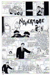
Here we have the first instance of The Raven leaving his signature “Nevermore” at a crime scene. Lucky for him that Poe’s The Raven was in the public domain! I don’t remember for sure, but I think this character started with the “nevermore” gimmick and grew around that, which is a rather backward way of developing a character. Again, why? Because it’s cool! (Or so I thought at the time.)
This is also the first example of my extremely poor ability to judge how much text is reasonable on a comic page. There’s barely room for the characters in the bottom half of this page. It would almost be forgivable if the text was any good, but it’s just a load of exposition. (My horrible lettering is really on display too; check out those uneven word balloons!)
I like how this page was laid out. Again, the execution is less than stellar, but I’m not at all embarrassed by the storytelling on display. I’ve never really been much good at drawing vehicles and right here in panel 1 is a great example of how not to draw a car. (I can’t be sure, but I think the number on the plate is 2112, in honor of the Rush album. I was really into Rush. I still am.) The funniest thing about this page for me is the woman in panel 4 with the cartoon hearts dancing around her head. To indicate she has the hots for Dominic, in case you are unaware of the standard cartoon visual shorthand for love. Which—it must be said—really has no place in a “dark” superhero comic like we were attempting to create.
That’s enough for now. We’ll finish up on Friday.
Shawn and Al

Comments are closed.