Nevermore, part 2
Here’s the conclusion of our look at our first comic project, The Raven. The first part is here.
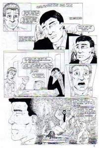
Aside from having the cheesiest name ever, Dominic Stearn was also hampered by the inability to keep a secret. His buddy merely mentions that he looks tired and Dom confesses to being a superhero. Then we get more exposition, in case you had started missing it since the previous page. Also, more backward character development: I had it in my head that I wanted the villain’s name to be Lucifer (I know, cool, right?), so I give him a Satanic origin story. Listen, I wish I could blame this on drug-crazed college life, but I was never into that. This lameness is all natural.
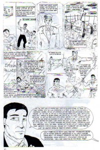
Guest starring Joe Piscopo! Again, I really like the layout here. Enclosing Tom in the exclamation point-shaped panel is clever; too clever by half for me to have come up with on my own at this point in my artisitic career, I’m afraid. In other words: I stole it from another comic, in all likelihood. I like Dom’s profile leading into the flashback, which is ruined by my complete lack of skill in rendering light and shadow effectively.
I agree. I think your layouts were pretty good, and this one especially so.
Here’s more of Dom’s origin story, presented in text-o-vision. Dom’s mentor is a Japanese man, which makes sense, given the whole samurai angle. But he runs a Chinese restaurant. Why? Because I liked Chinese food, and hadn’t yet discovered sushi. Brilliant. Also, I wanted him to be a samurai, but I also liked nunchaku and shuriken. Those aren’t traditional samurai weapons, but what the heck. Throw ’em on the heap!
The ’80s action movie training montage is cool, right? My command of anatomy was such that everyone seems formed from lumpy clay. Check out Dom’s eyes in the last panel. “Wonky” doesn’t being to cover it. I haven’t quite figured out how to draw clothing either. Hell, let’s just all agree that my drawings are precisely what you’d expect from a teenager with no real training who taught himself to draw by copying comic books.
I know you mean that in a negative way, but looking over these pages after all this time, I’m struck by how good you were, considering your lack of training. Sure, you may have lacked technique and refinement, but what you accomplished with raw talent was impressive.
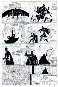
I will give myself credit for not cluttering up this page with a bunch of dialog. I’ve never liked comic book fights where the combatants talk more than they punch.
I hate to keep crowing about the layouts, but I think this fight scene flows rather well. The basics are in place, but the poses, the rendering, and the backgrounds are all executed with a singular lack of dynamism. More lousy sound effects, too. The dude crashing through the window might seem a lot clearer with some color (or effective inking). My lack of knowledge of anatomy and the muscles that make up an actual human being are on display again here. I like what we were trying to do with the Raven’s costume, but I wasn’t skilled enough yet to really pull it off. There’s a neon sign in panel 1 that says “Swiller Beer.” That’s kinda funny.
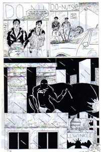
Hey, cops coming out of a doughnut shop. That’s original! And so our tale of cliches and bad characterization comes to an end. Frankly, I think Al came out of this exercise looking better than I did, and that’s not just my usual self-loathing talking. Like most people, I’m my own worst critic, but even so, this was painful to revisit. Granted, we never expected that this would be published. We did it strictly for our own enjoyment. So maybe I should forgive all of the self-indulgent touches. Nah, that doesn’t sound like me. Worst. Writing. Ever!
Another dramatic rooftop shot! Only this time with rain! and nunchucks! and. . .Bullwinkle?! Check out the little Raven symbol at the very bottom of the page. That’s probably the coolest thing on display in any of the 24 pages of The Raven #1. The Raven symbol itself is pretty cool, I have to admit. I created a new, 21st Century version of it not that long ago. I’m not sure the Raven is finished altogether; Shawn and I have talked about revisiting him many times in the last 20 years (the last iteration took on a distinctly cyberpunk-ish flavor.)
Anyway—I don’t think I came out of this looking good either. To say the artwork is amateurish is much too kind. Still, it was a stepping stone of sorts. We wanted to create a comic book and we did. It was fun to plan out, talk over the various details and plot, and to work on the art. That the final product is not so great is almost beside the point. Hell, the best result of all this is the long-lasting friendship that was solidified by the process of creating this comic. This was the first of many things Shawn and I have collaborated on, of which The Specialists is just the most recent and most visible to the rest of the world.
Yeah, there’s a kernel of usable idea in The Raven. But aside from the visual design, I wouldn’t use anything from this old comic. He really is a Batman clone, right down to the billionaire playboy secret identity. And my immaturity is clear in the character’s details. He protected Denver because that’s where I was from. He drove a Corvette because I liked that car. The whole concept was built upon the flimsiest of foundations: the catchphrase “Nevermore”. (Like Bruce Wayne, Dominic chose his alter ego in order to frighten his enemy. Why would the villain be afraid of a raven? Because he lost his eye to one as a boy! See, it writes itself when it doesn’t have to make sense!)
And yes, I agree, though I cringe at the sight of it now, I’m glad we did this back when we were supposed to be studying. If we hadn’t, we’d probably never be doing The Specialists now.
We hope you enjoyed this little stumble down Memory Lane. Next time in Amateur Comic Book Retro-Vision: The Raven issue #2!!
Shawn and Al
I love the commentary involving the both of you. Well done! Bravo! Bring on more crap!
i agree with Linda.