Lines and Colors, part 2
Hey kids. Welcome to Part Two of my guide to how each page of The Specialists is created (here’s Part One). In this installment we’re going to look at the digital portion of the process. Let’s dive in again, shall we?
Note: My working version of every page is done at high-res (300dpi) for eventual printing. The final version of a page is 67% of the 11″x17″ original art. I’ll create a separate, low-res version for the site as the very last step.
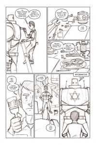
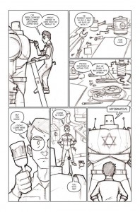
(Click the thumbnails to see larger versions of the images.)
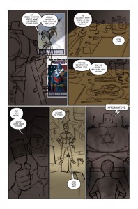
LetteringI would normally use Adobe Illustrator to do the lettering for a page. Since I don’t have Illustrator at home, I do the lettering in Photoshop. I copy the dialogue directly out of the script and paste each word balloon’s worth of text onto its own type layer. My primary dialogue font is Silver Age UC by Nate Piekos (Blambot); The Golem gets a more robotic look for its speech (Self Destruct Button, also by Mr. Piekos). Any sound effects are created with one of the 1,000 or so typefaces cluttering up my fonts folder. I try to keep chunks of dialogue fairly small, usually a sentence (or two if they’re short). I draw the balloons and tails with Photoshop’s vector drawing tools, fill the shapes with white, and assign a 5 pixel black outline. Arranging the balloons can be a bit of an art; I don’t want to obscure any important elements or characters, but I want them to flow in a way that isn’t confusing to a reader. I’ll often go back and tinker with placement all the way up until the page is finalized. You’ll also notice I’ve performed some surgery on the Golem in panel 6, making it wider as well as centering it. Outlines
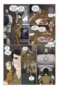
This is a fairly simple step. In order to help clarify characters/objects and add a bit of depth, I add black outlines to strategic elements. This is as close to inking as I get. Thicker outlines help to bring shapes to the foreground; in other words, a shape with a thick outline will seem closer in space than a shape with a thin outline (or none at all). So I’ll vary the thickness of the line depending on how much I want it to advance, or seem closer than other elements in a panel. This is most apparent in panel 5, where the Golem has a thick outline, but Max has none (making the Golem darker than Max and the background will help this effect even further—dark colors advance, while light colors recede, or seem further away in space). I draw my outlines with Photoshop’s Pen tool, then apply a black stroke, anywhere from 3 to 8 pixels, usually. This results in an outline of uniform thickness, also known as a dead-weight line. I prefer it this way for The Specialists. I’ll also outline any geometric shapes I think need it, like Max’s glasses in panel 4. Background Colors
In this stage, I drop in large areas of background color on a new layer. For most pages (or scenes) I have one unifying—or base—color that I use to set a mood, signify a particular location, time of day, weather condition, etc. depending on what the page or scene requires. For this page the base color is a darker shade of warm gray, seen at the lower portion of panel 4. Once the base color is set, I fill in large areas of solid color as needed: Max’s worktable in panels 2 & 3, the floor in panel 5. Once that’s done, I like to add some shading to help create depth or focus attention on a particular character or element. Pay particular attention to the shading in panel 1. I’ve also had a little fun with texture in panel 6, built up with varying opacities of different colors with a brush designed to mimic a certain texture. Lastly, I’ve added the Captain Victory and Bombardier posters that have been used elsewhere in the story. I’ve blurred them a bit to add some depth to the panel. Flat Colors
Next up are flat colors (or flats). This can be a fairly time-consuming step, depending on the complexity of the panels and how many characters or elements exist on the page. All of this is done on a new layer so that after the flat colors are in, I can select characters or large areas and replace, adjust, or otherwise tweak them without messing up the background colors. Flatting involves selecting a particular area—say, Max’s coveralls or his face—and filling it with the appropriate color. I do this selecting with Photoshop’s Lasso tool; the laborious nature of this step comes from clicking with the tool at all the various points around the perimeter of a shape or area until it’s outlined so that I can fill it with a solid color. I’ll usually keep a previous page open so I can easily sample colors for each character to maintain consistency across the story as a whole. On this page, I’ve gotten a little ahead of myself and added some gradient shading to the Golem, and some shadows in panel 5. I’ve also added a light outline to Max in panel 4. This serves no purpose other than as a stylistic touch that I like. Shading
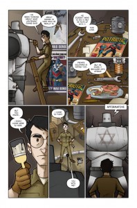
Here’s where coloring starts to get a little more interesting for me. I begin to use shadows to give the characters and objects on the page a bit of form and depth—what we creative types call rendering. For this page, I’m using a warm gray for my shadows. On yet another new layer, I use the Lasso tool again to draw out the shapes and contours of where the shadows would fall depending on light sources. I set the feathering of the Lasso tool to 2 pixels—this makes the edge of the shadow shapes a tad softer. Once the shapes are drawn and filled with gray, I take the Smudge tool and soften the edges further. I may also use the Brush tool set to 10% opacity and feather the edges a bit with several passes. In some cases, I use my shadow color to create a further sense of depth by darkening foreground shapes such as in panel 6. You’ll notice I’ve altered the background in panel 1 to make it seem more like a light source is off to Max’s right and somewhat above. I’ve also adjusted the positions of the posters to look a little more tidy. I then render Max’s one visible eye in panel 4, adding a catch light as well (it’s amazing how one little dot of white can add life to a face). Lastly, I’ve adjusted the word balloons in panel 2 to help them to “read” more clearly. Final Colors
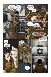
In this last stage, I add a few more finishing touches. I use white to add some highlights where appropriate (as on the paint in panel 4) as well as some lighting effects such as the Golem’s glowing eyes and the glow of a diffuse light source behind the big robot. I also indicate the glass of Max’s specs with an area of semi-transparent white and a couple strategically placed gradients. The Star of David symbol on the Golem is added last, using a rough, brushed look. Time to step back and take a look at the whole page and fix any major problems that may have escaped my notice before. At this point, I may make adjustments to colors or brightness of the page as a whole. The very last step is to flatten the layers and save a low-res JPEG version for publication on the page.
Whew! That was a lot of information, wasn’t it? Thanks for taking the time to read through the process, and I hope you learned a thing or two. Please let me know (in the comments or via an e-mail) if you have any questions. I love to talk technique, so if you’re a fellow comic creator or Photoshop user (or just interested in creative stuff in general), I’d love to hear from you.
