A Super-Quick Poll About a Silly Subject
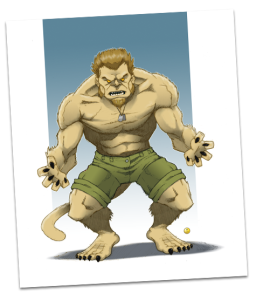
We’re in the process of giving our character pages a bit of a facelift by enhancing the artwork to reinforce the “dossier” theme. Now, in addition to the original concept drawing, we also have a “photograph” of the character out of costume. Here’s Max’s page as an example. All of The Specialists have been updated, except for Hartmann, because we can’t agree about which artwork to use. (Click the images below for a larger version.)
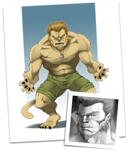
Here’s the version with the photo-style image of Hartmann attached. I like it because it’s consistent with the others, but Al feels like it looks a little redundant, since Hartmann doesn’t really have a costume, so the photo isn’t a contrast with the main picture.
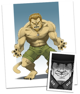
In this version, Al substituted the photo with some artwork of a pre-Asylum Hartmann from within the comic. He likes that this version shows what is essentially Hartmann’s “secret identity,” but I don’t like it because it’s inconsistent with the other characters.
Finally, here’s the version that will result if we both throw up our hands and say “Fine then, he just won’t have a second picture!”.
We simply can’t agree on which of these is best, so we put it to you, our dear readers, so that we are not forced to come to blows. (It would be a nasty fight; Al has the advantage of reach on me, but I’m not afraid to fight dirty.) Please take a moment and vote in the poll below, and we’ll make our decision Sunday night. Thanks!
Update:
Thanks to everyone who voted in our poll! The “photo” version of the artwork won by a wide margin, and Hartmann’s page is now complete! (Also, an even wider majority agreed that slightly longer arms are no match for raw savagery, so it’s a good thing — for Al — that this conflict didn’t have to get physical.)
If Hartmann is to remain the only one not having the “secret identity” it would be cool to have no other pic at all and you wouldn’t have to be all “we both throw up our hands” because it would rock